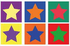
Artists use color harmony to create aesthetically pleasing masterpieces. It is when colors work well together. How do you achieve this? We do so by using color combinations.
COLOR COMBINATIONS

Color combinations are tried and tested selections of colors that help us achieve cohesive and interesting paintings. Artists don't just pick out random colors, they know that color selection greatly affects the mood or impression of a painting. So, they use specific color combinations, and so should you.
But there are various color combinations! How do you pick out which one to use? Before you start anything, consider the message you want to express through your art work. Do you want an artwork radiating happiness? Do you want to paint a serene landscape? Perhaps a moody portrait?
Once you've decided, see which combination(s) fit your choice of mood.

ACHROMATIC

MONOCHROMATIC

ANALOGOUS
Colors used: Lemon Yellow, French Vermilion, Red Sennelier, and Ivory Black
This color harmony uses three to five colors which are all adjacent of each other in the color wheel. It is one of the easiest to use in paintings as it is pleasing to the eyes. Compared to the Achromatic and Monochromatic color schemes, it is a step up with regards to visual contrast.
COMPLEMENTARY

Colors used: Forest Green and Sennelier Red
Two colors that are opposite of each other in the color wheel are called "complementary" colors. This combination produces the highest contrast possible. When mixed together in the paletter, it produces gray or a neutral color. Many of pop artworks use this color scheme due to its boldness. It can be tricky to use, you must be careful with the amount of color saturation in painting to avoid over-contrast. It's good to study carefully which color will be used as the main color of your subject matter and background. In the painting above, red is used as the main attraction of the painting whereas green is used as a supporting color and background.

Here we see how other complementary combinations. Look at how each color interacts with the other as the "star" of a work. The colors in the illustration are all in full saturation. You may make colors lighter or darker to balance and harmonize them.
SPLIT-COMPLEMENTARY

Colors used: Phtalo Green Light, Sennelier Red, Forest Green and Phtalo Blue (for Blue Green)
The split-complementary color scheme is like the complementary color scheme, but thi combination is usually used with a primary color (for this example it is red) and two tertiary colors (blue green and yellow green). This combination lets you explore more colors at once. As you add more colors (along with their different shades) in a painting, there is more challenge to create a cohesive work. Remember that you can mix colors together to create gray or neutral colors for shadows.
TRIAD

Colors used: Lemon Yellow, Sennelier Red, Phtalo Blue
This color combination uses three colors that form a perfect triangle in the color scheme. This combination gives a more intense effect. It's a good choice if you want to create interesting and striking paintings. Try the different triads possible in the color wheel to achieve different visually intense harmonies. Don't be afraid to use and mix vibrant colors together.
Lastly, don't be afraid to paint a single object with the different colors present in a color combination. Experiment and see which combinations are best for the effect you want your painting to convey.


1 comment
Ivan Sinigaglia
I loved this post. Helped me a lot. Thanks