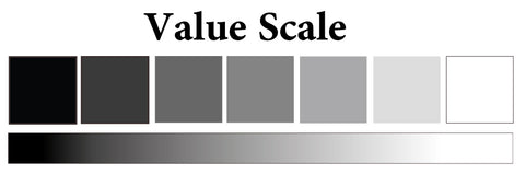
Try to paint this using only black paint. In your palette, mix black and a little bit of water. The left-most box should be painting with the richest black. Every time you go a box to the right, simply add a bit of water to your black mixture in your palette. Eventually your last few boxes will be painted with a very diluted gray. Keep the right-most box empty to show the purest white (the white of the paper). This activity is good for knowing your water and paint ratio as well as understanding how to achieve saturated and desaturated applications.
Watercolor painting involves tons of color mixing. A lot of artists can utilise the fewest colors to achieve a vast range of hues, tones, and tints.
Terms to remember:
Note that "Color" and "Hue" are two terms usually interchanged by a lot of people in different practices handling colors.
It is of utter importance that an artist knows very well what his/her palette can achieve. A good, versatile set of colors is able to create a satisfactory amount of colors for painting almost all subject matter. For this article, we are using the 12-color Sennelier Set.
This set has a good selection of colors. The colors are: Burnt Sienna, Ultramarine Deep, Phthalo Blue, Warm Sepia, Lemon Yellow, Carmine, French Vermilion, Alizarin Crimson, Payne's Grey, Phthalo Green Light, Forest Green, and Dioxazine Purple.
To fully understand the color palette more, you may mix the color wheel by only using primary colors. The set has only one yellow (Lemon Yellow) and one primary red (Carmine) so create 2 color wheels to compare mixtures using the two blues (Ultramarine Deep and Phtalo Blue). The middle of the color wheels below are neutral colors that you can achieve.
Neutrals are created by adding complementary colors (colors that are opposite of each in the color wheel). See below for possible combinations.
These neutral colors are great for shadows and desaturated mixtures for creating realistic paintings. A lot of artists debate about the use of pure black in painting. This is because simply putting pure black in a painting tends to produce a flat looking finish. Using your own mixture of grays is great for creating the illusion of a lustrous shadow or dark areas that have more depth.
The other colors in this paint set can create even more colors for your use. It can be seen that Lemon Yellow added with Ultramarine or Phtalo Blue produce slightly different greens. This smallest shift of color hue makes big differences. French Vermilion when thinly applied on paper almost looks like orang. This means this hue has a yellow bias. See how French Vermilion (a warm red) mixes great with Ultramarine Deep (a warm blue). However, mixing French Vermilion with Phtalo Blue (a cool blue) makes for a neutral mix of violet.
It is important to know about color bias. Colors are always biased towards either side of where they are positioned in the color wheel. A yellow may either have a green/blue bias or an orange/red bias. Using the logic of complementaries combined to make gray or neutrals, adding colors of different color bias produces muddy mixtures. To read more on color bias and purity of colors, see:
To make things easier later on, especially if your are painting outdoors. It is good that the 12 color set of Sennelier has pre-made light and dark greens, browns, a violet, and Payne's gray to be added to any color for darker tones.
How about you, have you tried mixing out the possibilities of what's in your palette?
]]>
There are many ways to combine and experiment with your colors. One common way of creating a mixing guide is by creating a color wheel with your colors. (See Color Mixing 101). Other methods are the "Layered Mixing Chart" and by expanding your color range with the "Gradual Mixing" method.
Watercolor may be used in layered application. In the layering process of painting, each color layer is seen as light bounces off colors simultaneously creating new colors.
Another way of seeing the full potential of your colors is by:
To carefully see how your colors will interact with one another, it is best to take time and do this activity. Gradual mixing is done by the bit-by-bit mixing of one color to another.
For example, mixing Cobalt Yellow Light with Helio Cerulean would look like so:
Before you start, make sure to prepare a lot of yellow mixture on your palette. Then, paint the first box. Add a very small amount of the Helio Cerulean to the yellow mixture on your palette and gradually add more every time you paint a new box. The last box should be the pure mixture of your Helios Cerulean. There you have it, a gradual mix of your colors. Do this method for each pair possible in your palette if you would like to keep record of all the possible colors they can achieve.
With the following colors of Schmincke Horodam, you can achieve a wide range of clean and bright tertiaries:
]]>
To guide us in this exploration, we will check the following of each color:
The brand, Campus by Raphael is a student-grade set that offers a small range of colors that they have not declared the names of. There is no data available for their opacity/transparency ratings, staining or granulating abilities, pigment content and lightfastness. Thus, we will only be able to compare the sets colors along with different brands/colors that look similar. For the sake of information, we have substituted the names of these colors for the meantime.
On the other hand, Sennelier La Petite (student-grade) comes with hue name and color number, lightfastness, transparency and opacity rating. Using their color numbers they may be compared with their artist-grade counterparts.
The Lemon Yellow of all three: Schmincke Akademie (student-grade), Schmincke Horadam (artist-grade), and Sennelier Aquarelle (artist-grade) are visibly the same with the swatches above. They are all actually made with the same pigment, PY3 or "Hansa Yellow" but commonly described as lemon yellow for its green undertone or bias. The chemical compounds of the pigment are: Azoic pigment and mineral filler. In this case, Lemon Yellow across the 3 paints are, in fact, the same. Only differing in amount of pigment amount in respective formulations and in transparency.
The Primary Yellow of both the artist and student-grade of Sennelier look identical even with opacity levels. They share the same color code "574" too on Sennelier's color chart. However, their declared ratings are different with the professional grade declared "Not Rated" and the student-grade is given ASTM - III but the pigment "PY74" is given a "Good Lightfastness" rating nonetheless so it is safe to say that either will be able to withstand some exposure to sunlight.
The last box, not primary yellow but azo yellow by M. Graham looks almost the same. However, the Azo Yellow of M.Graham in comparison with the Sennelier yellows here, is rated as "Excellent" with ASTM - 1 and declared as a "Staining" color. It is composed of PY151 which may give its color the brownish tint to it. Making it very different from the 1st two yellows and a good choice for your mixing neutrals and Earthy shades.
The two colors above are similar looking but the two are very different. It is important for us to also be careful in making some assumptions solely based on how colors look when swatched. The Sennelier La Petite Orange 645, compared to the "Chinese Orange" of the artist-grade Sennelier, is more yellow than orange and is transparent. Chinese Orange contains: PY150, PR209,and PBr23. Chrome Yellow Deep of Schmincke Horadam contains a single pigment, PY65 which is a deep, reddish, Hansa Yellow. Two completely different formulations but the paints look very similar. One scenario where we can opt to choose the one that uses a single, pure pigment.
Here we see that Sennelier Aquarelle has a more yellow shade compared to the other three "Yellow Ochres." Notice the nuance in the shift of Pigment number from PY43 for Sennelier to PY42 for Schmincke Horadam. This is a good note to take, that a small change in pigment number in compositions of paints may drastically change them.
The bottom two swatches are significantly lighter too because they are student-grade paints. This means we will need more coats or layers of those paints to achieve washes as saturated as the ones done with single layers of artist grade paints.
All of the Ultramarines here of their respective brands used PB29 which may be a synthetic alternative or the real ultramarine from Lapislazuli (a semi-precious stone). The quality of the stone may differ too so the ultramarine blue color price varies according to amount of the said pigment and the quality of the stone used. A synthetic alternative may be used as well to mimic the real stone. Do not be discouraged of having synthetic colors because manufacturers have long been able to control a lot of aspects of synthetic dyes and pigments letting them improve colors in comparison with natural ones in terms of lightfastness and brightness. With this in mind, we rely on the lightfastness rating declared by brands.
PG7 is the same pigment that stands alone as Viridian Hue with Sennelier Aquarelle. It leans toward a blue bias and is present in two of the Sap Greens above. Whereas the other one uses PB29, ultramarine and PY153. Despite M. Graham and Schmincke Horadam both having PG7, they look very different. M. Graham uses PY110, a yellow with a red undertone, when mixed with green (its complement) results in a slight grey tint in the resulting color. Hence, we have a heavier, deeper sap green that looks more natural. On the other hand, Schmincke Horadam combines PG7 with PY153, a yellow like "Indian Yellow" with little orange bias that doesn't result in a dull shade for green.
This is another example of how different brands can produce the same looking color but with different characteristics and pigment composition. Below, you will see that the "Yellow Ochre" of Schmincke, when diluted looks exactly as their Naples Yellow. This brings us to another note, explore color saturation to find out if you can achieve certain colors just by adding water or more paint in your washes.
Schmincke is one of the most reliable brands in terms of their student-grade paints. It is obvious in the swatches above. All size colors are almost identical in saturation, but in fact the swatches were all done with single layers of paint. So unlike other brands that we need to create multiple layered washes to achieve bright, saturated colors, Schmincke Akademie is our choice for high intensity colors without fillers. The Akademie of colors has only 24 colors available but 15 are single-pigment colors. More information in comparing the professional and student grade paints of Schmincke may be found here:
It's fun to get to know your colors and research on the characteristics of pigments in them. The more you know, the more you will understand how mixing together all sorts of color hues can help you achieve your masterpieces.
Sources of references:
]]>
Let's start with the necessary tools for watercolor painting as every artist must have his or her tools ready even before creating.
There is a multitude of different paints available today. It is important that artists secure paint that offer reliability and great performance but how do you identify which paints available are for students and artists?
However, some, such as Sennelier La Petite, have been formulated to let serious students afford good quality paints for inexpensive learning. These watercolors are made with varying amounts of lower-grade pigments and fillers to increase paint volume. Some brands of student-grade paints may not be as vibrant as the others and they are fugitive (impermanent).
Artist-Grade Paint
Artist-grade watercolors are professional paints that assure artists of high-quality ingredients with no substitutes. They contain pure pigments and are vibrant even after years of shelf-life. Paintings made with such can withstand lifetimes without fading. Sennelier extra-fine watercolors is the artist-grade line of Sennelier. They combine the best pigments and most refined gum agents with honey resulting in vibrant, luminous, and lively watercolors.
If you would like to know more about the nature of watercolor paints, head over to: Getting To Know Watercolor
Artists are always on the lookout for the best tools. Watercolor brushes in particular, should be able to endure years of use whilst providing excellent performance and retaining original shape. It is first important to know that there different types of hair for paint brushes for watercolor.
Natural Hair
Natural fibres from different animals are utilised to create various brushes. All natural hairs have ridges or pockets in each strand. These hold and retain water, letting the brush load more paint at a time.
Mop
The mop brush is somewhat a bigger version of a round brush but with a fuller base. It is primarily for larger paint applications as it can hold more water. It is great for both floral brush work as well as background painting/ blending. The Raphael Soft Aqua Pointed Mop (top) is a synthetic mop that is at par with natural-haired mop brushes while the Raphael Lavis Pointed Mop (bottom) is made with pure Kazan Squirrel hair, making it one of the softest mops available. Both are fantastic for broad washes and blending.
The rigger or liner is a thin brush with long fibres. It holds more water and paint making it easy to create continuous lines without having to re-dip the brush. Shown above, the Kolinsky Gold Rigger is a brush that will always retain its shape giving you the best performance as you paint long, fine lines.
This brush is like the flat brush but with its fibres leading to a pointed tip. Simple strokes with this brush creates effortlessly perfect petals and leaves for flowers. It is also good for laying down washes. The Raphael Lavis Pointed Cat's Tongue Brush is made with pure squirrel hair, making it easy to handle due to its hairs' supple texture.
Palettes are for mixing or storing your watercolor paints. They come in different forms and materials. The most affordable material available is plastic but strong colors stain this material. An open flower palette (middle) is great for mixing your colors in big portions. The Mijello Fusion Watercolor Palette (left) is great for storing squeezed paints as it seals in moisture and will keep paints from drying or cracking. Metal pan- palettes like the Sennelier metal palette (right) is great for keeping colors in halfpans without them falling off. Metal palettes do not stain as much as plastic. Palettes made with porcelain do not stain but are heavy and fragile.
Fortunately, we here at Art Nebula PH take the time to offer testers of all our products when we have our pop-up shops. Click here for our next events: Take Me To Your Pop-Up Shop
Color combinations are tried and tested selections of colors that help us achieve cohesive and interesting paintings. Artists don't just pick out random colors, they know that color selection greatly affects the mood or impression of a painting. So, they use specific color combinations, and so should you.
But there are various color combinations! How do you pick out which one to use? Before you start anything, consider the message you want to express through your art work. Do you want an artwork radiating happiness? Do you want to paint a serene landscape? Perhaps a moody portrait?
Once you've decided, see which combination(s) fit your choice of mood.
This color harmony uses three to five colors which are all adjacent of each other in the color wheel. It is one of the easiest to use in paintings as it is pleasing to the eyes. Compared to the Achromatic and Monochromatic color schemes, it is a step up with regards to visual contrast.
Two colors that are opposite of each other in the color wheel are called "complementary" colors. This combination produces the highest contrast possible. When mixed together in the paletter, it produces gray or a neutral color. Many of pop artworks use this color scheme due to its boldness. It can be tricky to use, you must be careful with the amount of color saturation in painting to avoid over-contrast. It's good to study carefully which color will be used as the main color of your subject matter and background. In the painting above, red is used as the main attraction of the painting whereas green is used as a supporting color and background.
Here we see how other complementary combinations. Look at how each color interacts with the other as the "star" of a work. The colors in the illustration are all in full saturation. You may make colors lighter or darker to balance and harmonize them.
The split-complementary color scheme is like the complementary color scheme, but thi combination is usually used with a primary color (for this example it is red) and two tertiary colors (blue green and yellow green). This combination lets you explore more colors at once. As you add more colors (along with their different shades) in a painting, there is more challenge to create a cohesive work. Remember that you can mix colors together to create gray or neutral colors for shadows.
This color combination uses three colors that form a perfect triangle in the color scheme. This combination gives a more intense effect. It's a good choice if you want to create interesting and striking paintings. Try the different triads possible in the color wheel to achieve different visually intense harmonies. Don't be afraid to use and mix vibrant colors together.
Lastly, don't be afraid to paint a single object with the different colors present in a color combination. Experiment and see which combinations are best for the effect you want your painting to convey.
]]>
There are a number of aspects to watercolor paper, we'll discuss a few while comparing some of our papers. Below is a set of the tests we made with the corresponding papers. The top is to see how vivid and even we can make a swatch on the paper. Next is to see how the paper handles layers (seen with the red streak). Below that we scrubbed a dried wash of blue to see how papers handle scrubbing resulting to pilling and the bottom part is lifting softly on the washes while they were still wet. Go ahead and do these tests with your papers too.
Different pulps are used in the production of paper. This quality of paper performance is determined by its fibers. Common papers are made of cellulose, wood pulp, synthetic blends or combinations of these with different amounts of cotton. The highest quality paper is made of pure cotton rag which makes up most artist-grade papers.
There are different colors available when buying watercolor paper from Ivory white to white, cream and an even more yellowish tone. More yellowish papers offer a more cohesive tone for paintings. Some artists prefer to do a wash of a color as preparation before painting. This creates a sort of "stain" that makes their paintings more homogenous in terms of colors. Meanwhile, white papers to Ivory white offer full brightness and clarity of watercolors which are best for illustrators looking for vividness and accuracy of colors.
Sizing refers to a layer of gel that preserves and protects watercolor paper. It's what keeps paper from fully soaking up paints or from over blotting. Different brands have different amounts of this on their papers. Some have more than others, which can be difficult to paint on with soft brushes.
Thickness of papers vary from 160GSM, 300GSM, to 600GSM or higher, the higher the number, the thicker the paper. It is important to know that thinner papers buckle when soaked with water which may pose as a problem when painting.
When paper warps, it is hardly possible to flatten it again for framing. This can be solved by pre-stretching the paper or using artists tapes to pin the paper down flatly. With 300GSM or higher, warping is not a problem as they're thick enough to keep flat on their own.
Different formulation of papers create different surfaces. Some are more compact and durable thus they do not get damaged easily when scrubbed whereas others are more loose and can get extreme pilling when certain techniques are done.
As a test, we created swatches of a single color on the different papers to compare durability.
Bee Paper 200 GSM displays minimal pilling when intensely scrubbed with a stiff brush
Bee Paper postcard paper shows more pilling when scrubbed immensely with a stiff brush.
Certain papers that are acidic change in color and yellow over the years, ruining precious paintings. Because of this, it's best to choose archival, acid-free papers that do not risk you of changing color over time. Fortunately, all our paper are just that!
Now let's compare the papers that we have:
Painting on the papers, you can see below the quality of what you can achieve on them:
Painting on the Strathmore 500 series is hard with a very soft brush and it is recommended that you soak it in water/ stretch it first or use a stiffer synthetic brush to apply paint easily especially if you're looking to create single stroke paintings. Bee Paper texture is comparable to that of the Cold Press and Hot Press Sennelier blocks whereas the Rough Sennelier block's texture is evident and it can hold more layers very well. These are just some of the qualities of select papers that we have.
Feel free to browse through our site, and create comparisons yourself!
]]>
There is a wide variety of meticulously crafted brushes in the market today. It is important to know about the uses and characteristics of a brush to further understand its value and how it can be useful to us. Many reviews are available online and you may browse through our selection of brushes too but you might wonder about differences in size.
]]>Let's talk about mop and travel brushes!
Mop Brushes:
Travel Brushes:
The Raphael Series 805 or the "Soft Aqua" mop brush is a synthetic mop that has been develop to be like no other. Its fibers are unlike the conventional straight synthetic hairs that don't hold paint and water well. Common synthetic hair is straight and lets paint slip easily. On the other hand, the hair of the Soft Aqua mop is are wavy- creating pseudo pockets to hold more water load, surpassing any stiff synthetic mop. This brush has a sleek black wooden handle with four nickel bands keeping everything in place.
The Soft Aqua mop, in particular, is great as a budget-friendly mop brush for any starting artist.
The second mop o
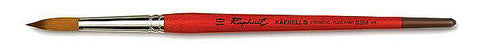
n our list is the Raphael Series 803 Lavis Pointed Mop brush. It is made of pure Kazan squirrel hair which is widely used for mop brushes for its resiliency and suppleness. Each fiber has natural pockets for maximum water and paint load. Kazan is claimed to be one of the best fibers for watercolor brushes. It is extremely soft and great for creating smooth, even washes. The tuft has a full belly that tapers to a fine point for details and line work.
Mop brushes that use squirrel hair do not "snap" back into original form unlike synthetic or stiffer brushes. This characteristic gives an entirely different experience. They are perfect for fluid strokes and layering because their softness reduces the risk of over scrubbing the paper surface in painting layers.
The Isabey mop is a popular brush for professional artists. It is known best for its Siberian Blue Squirrel hair. This hair, compared to the Kazan Squirrel hair, is longer. It is also very soft and offers great water retention. It works very well for laying down even washes and blending colors on paper. It is flexible and can be used for thin strokes and detail work too. The hairs are kept together by hand-tied genuine goose inside the transparent ferrule that is kept together by 4 brass wires.
Isabey has taken its Series 6234 and transformed it into a collapsible brush, ensured that its hairs are well protected so you can take it anywhere when you travel. This travel mop is traditionally made with the same Siberian blue squirrel hair, transparent ferrule, and lightly colored wooden body but with a brass gold case that also serves as its handle's extension.
It is only available in one size, size 0, which is great for small to medium paintings.
The Series 6201 travel brush is a round brush made of pure red sable. This type of fiber is springy and snaps back to original form easily. Such a brush offers great control for your strokes and handles paint fluidly. If you are into detail painting and are looking for a versatile travel brush with top-quality fibers, this brush is for you.
The Raphael 1793 travel brush is exactly like the Series 8404 brush with red sable hair. This round travel brush is able to hold exceptional water and paint load. Compared to other brands, this lightweight brush does not strain the wrist. The long gold cap serves as a removable cover and handle to balance the whole brush. Collapsed, it fits perfectly in any small, standard metal tin paint box.
To give you a good idea of how all these brushes find a middle ground, see the picture below.
From left to right the measurements of the brushes are:
Size | Diameter | Hair Length | |
Raphael Series 803 Mop | 0 | 7mm | 23mm |
Isabey Series 6234 Mop | 0 | 6.8mm | 24mm |
Raphael Series 805 Soft Aqua Mop | 0 | 7mm | 19mm |
Isabey Series 6202 Travel Mop Brush | 0 | 4.5mm | 20mm |
Raphael 1793 Travel Brush | unspecified | 4mm | 20mm |
Isabey Series 6201 Travel Brush | 6 | 3.3mm | 20mm |
Watercolors are available in sets that have generic color selections manufacturers deem as necessary base colors for artists. However, many of us sometimes find ourselves not using one or two colors much or at all. Then, we should consider creating our own selection of colors that will offer everything that we need. Don't be intimidated! It can be a pretty fun experimentation.
First, you will need a house for your colors. Metal tin containers are especially made for this purpose. They have trays that are adjustable for holding pans in place even when shook. Empty full and half pans are available too. You can view them here.
Customizing your own palette is a good way to really get to know our colors. This process may be up to personal preferences or to practicality. For example:
How about you, what do you usually paint? Let's create a few color combinations that you may consider to include in your own palette.
These three colors produce a bright primary color wheel when mixed together. There is minimal color bias so it is a safe selection for color mixing as seen with the saturated and vibrant secondaries and tertiaries produced in this color wheel. Primary Yellow and Blue Sennelier are both clean, transparent colors while Sennelier Red is semi-transparent but a very bright hue. All three are made from single pigments and have excellent lightfastness ratings. Overall, these three colors are good basic hues to have as a stand-alone palette. You may add in tertiaries or other colors such as browns and greens or you may opt to extend this palette by getting color-biased primaries (cool and warm colors). Here is a good site with the list of color biases: Color Biases of Artist Pigments
Opera Rose, Quinacridone Gold, and Cinereous Blue are bright colors that may be used in portraying interesting works. It's a great selection if you are looking for a unique palette to play with and experiment. It is great for florals, interesting portraiture, and golden sunset paintings. Opera Rose is a beautiful pink that produces great violets and oranges with the other two colors here. Cinereous blue is opaque but can be easily diluted with water. The colors are excellent in lightfastness rating except for Opera Rose, rated as average. This selection of colors would be great for artworks that will be scanned or photographed for printing.
Those are but a few combinations of colors that you can include in your own palette. Customising your set will add flare to your works support your unique style. So go ahead, you have the artistic freedom to create your own family of colors. Small palletes like the one below to bigger palettes that can hold 48 half pans are available here. You can always take out the metal tray in between to fit even more pans.
The picture above contains M. Graham, Sennelier halfpans and tubes squeezed into pans.
Don't forget to show us what you learned here by posting pictures and using the hashtag #DiscoveringWatercolors on Instagram or Facebook!
Watercolor is one of the most widely used media in both classical and contemporary art. It works with light in letting us peer carefully through each layer of paint thus it is known for its capabilities to depict translucency and depth.
Artists used to create their watercolors personally-preparing everything from grinding pigments to packaging their own paints in shells or dishes. Today, various commercial companies have refined trademark recipes and processes to bring us the best paints in terms of quality and handling. So, with the finest tools at hand, what should we know to get started with our watercolor journey?
Watercolor is primarily composed of pigments, a water-soluble binder, and other additives. Pigments may come from organic materials (plants and insects), inorganic materials (minerals and rocks), or they can also be man-made or synthetic whilst water-soluble binders like processed Gum Arabic comes from resin. Other additives like preservatives and honey add to the character of certain watercolors affecting their shelf life or how easily they can be handled.
Click below to see how Sennelier refines their watercolors to bring artists the best professional products.
How Sennelier Watercolors Are Made
Today, watercolor is available in two major forms:
Watercolor is available in “full” or “half” pans. The paints are either poured directly into the pans or dried after preparation, cut to size, and transferred to pans for packaging. Paint pans are available in sets and individually. They are handy as they are “ready-to-go” for direct use; simply rub them with a wet brush and let pans dry after use.
Watercolor is also available in tubes. In this form, paints are kept creamy for extended periods of time. The mixture of paint in tubes is usually the same as that in pans. Tube sizes vary in sizes and are available in sets and as individual pieces. This is usually more cost-effective as you get more paint for your money’s worth. Paints may be squeezed unto empty pans or palettes.
T : Transparent
O/T : Semi-opaque
O : Opaque
Transparency in watercolors provides venue for light to pass through all subsequent color layers achieving depth and richer color body in paintings. Opacity in watercolors, on the other hand, blocks off light thus hindering the clarity of sub layers.
Transparency Test
Using your select hues, paint over a thick black line as how you would by swatching your colors. Once the swatch is completely dry, the results are apparent. Some colors obviously cover the black line- these are the more opaque colors whereas those that are not seen more transparent.
As transparency is widely sought after in watercolor, opacity may also play as a key element in paintings. Opaque colors, especially those that are of lighter hues, may be used at the end of painting to add highlights that you may have missed to leave out
Watercolor when fully dry, unlike other media, may be reactivated with water. However, this aspect differs by degree. Some colors are very strong and stain intensely thus they are difficult to lift once applied. On the other hand, some colors are non-staining, making it easy to erase or lift from the paper. It is good to do a "Lifting Test" to see which colors are hard to erase and which are more forgiving.
Lifting Test
Test your colors by trying to erase or lift the colors from the paper with a brush. If you can clearly see the white of the paper, then your colors are non-staining but if there is a faded amount of paint that cannot be taken out, then colors are staining.
Watercolor pigments react differently to water. Some pigments separate from their binders and become granulated, grainy or textured when completely dry while some dry to a very fine smooth finish. Colors in different brands differ in granulating properties so it's best to swatch colors to know their individual characteristics.
Lighftastness pertains to the permanence of colors. Using the ASTM (American Society for Testing and Materials standard) guide to measuring qualities of artist paints, the categories are:
I. Excellent Lightfastness
II. Very good Lightfastness
III. Medium Lightfastness
IV-V. Light Sensitive or Fugitive
Permanence is dependent on the strength of paint pigments especially when exposed to direct sunlight or UV rays. Over the years, brands have been able to formulate synthetic pigments that mimic and replace fugitive natural colors like Alizarin Crimson and Madder Red, so artists today may create works that could stand the test of time. Lightfastness ratings conforming to the ASTM are usually found on paint labels.
It is always good to learn more about the nature of watercolors to fully know its creative possibilities. Watercolor continues to evolve which is why we hope that you (whether you are a hobbyist, beginner or professional artist) continue to explore, experiment, and create with watercolors!
CLICK THIS LINK TO SEE ALL OUR AVAILABLE WATERCOLORS!
]]>